
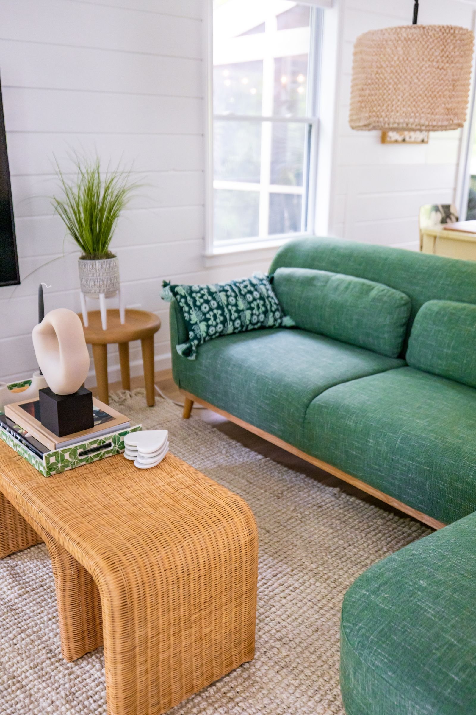
A 'considered' room usually has a color plan, even if it's a simple one — most rooms that feel randomly decorated aren't missing good individual colors, they're missing a ratio. Too many colors competing for attention, or one accent color that shows up once and never again, both read as unplanned even when every piece in the room is nice on its own.
None of what follows requires hiring a colorist. It's mostly about ratio, where color moves through a house, and testing a color properly before committing a whole room to it.
Use a Simple Ratio Instead of Guessing
A rough 60-30-10 split works as a starting point for most rooms: about 60% a dominant neutral (walls, largest furniture), 30% a secondary color (a rug, curtains, an upholstered chair), and 10% an accent that shows up in smaller doses (pillows, art, a vase). Rooms that feel chaotic usually have that ratio inverted — too much accent color competing at once, not enough of a calm base to anchor it.
Repeat the Accent at Least Twice
A single accent color that appears only once in a room — one blue pillow in an otherwise neutral space — tends to read as a leftover or an afterthought rather than a decision. Repeating that same color in at least one more spot, even a small one like a book spine, a vase, or a piece of art, makes it read as intentional instead of incidental.
Treat the Ceiling as a Real Color Decision
Most ceilings default to flat white without anyone deciding that on purpose. A ceiling painted to match the wall color, or in a slightly lighter or deeper tone of it, can make a room feel taller and more cohesive than a stark white 'fifth wall' that contrasts with everything below it — especially in a room with lower ceilings, where the contrast line draws the eye to exactly the height you're trying to minimize.
When White Ceilings Still Make Sense
In rooms with detailed molding or a ceiling height you want to emphasize, a crisp white ceiling can be the right call. The point isn't that colored ceilings are always better, it's that the choice should be made rather than defaulted to.
Let Color Flow Between Rooms That Connect
In an open or semi-open layout, a color scheme that changes abruptly at a doorway reads jarring, even if each individual room looks fine on its own. Rooms that flow into each other visually — through a hallway, an open kitchen, an archway — read more considered when they share at least one connecting color or undertone, even if the overall palettes differ.
Test Color Properly Before Committing
A paint swatch under store lighting tells you almost nothing about how a color will look on your actual wall. Paint a section at least two feet square directly on the wall, in more than one spot in the room if possible, and check it in morning light, midday light and evening lamp light before buying enough for the whole room.
- Test on the actual wall, not a poster board taped up — wall texture and existing trim color both shift how paint reads.
- Look at the swatch away from other strong colors nearby, which can visually shift how a new color appears.
- Give it at least a full day, checking morning and evening, before deciding.
- Photograph the swatch on your phone in each lighting condition — camera white balance often reveals undertones your eye adjusts past.
Common Color Mistakes That Undercut a Room
- Choosing colors room by room with no connecting thread through the house, so each room feels like a separate decision.
- Defaulting to a flat white ceiling without considering whether a warmer or matching tone would help the room.
- Adding an accent color in only one spot, so it reads as incidental rather than intentional.
- Skipping the on-wall test and trusting a small paint chip under artificial store lighting.
Frequently Asked Questions
How many colors should one room have?
Three works well for most rooms — one dominant neutral, one secondary color, and one accent, roughly in a 60-30-10 split. More than that usually needs a very confident hand to avoid feeling busy.
Should every room in a house use the same color palette?
Not identical, but connected — sharing an undertone, a trim color, or one repeated accent color between adjoining rooms keeps a house feeling like one considered whole rather than a series of unrelated rooms.
Is a dark accent wall still a good idea in a small room?
Yes, in the right room — a dark wall on the side furthest from the main light source can make a small room feel enclosed and cozy rather than smaller, especially paired with warm lighting. It's a different effect than an all-light, expand-the-space approach, and both can work depending on the goal.
More Ideas You May Like
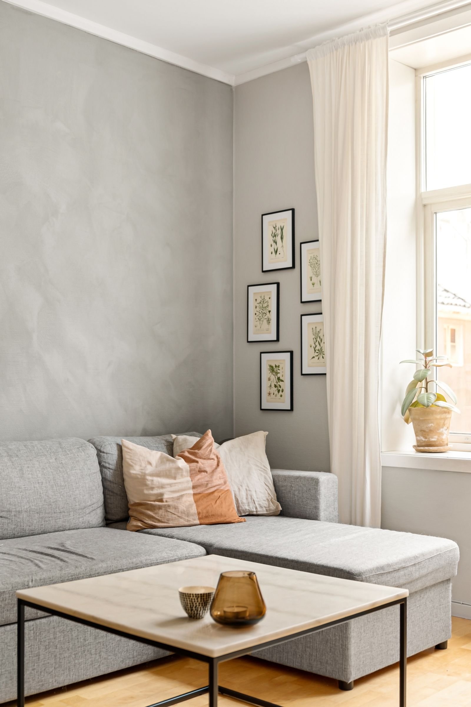
Modern Home Design Ideas
Modern design is mostly about sightlines, finish choices and lighting treated as a focal point, not a specific style of furniture or color palette.
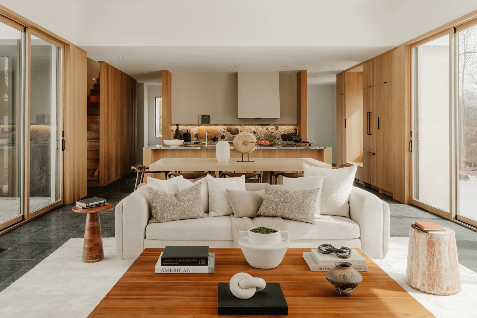
Modern Interior Design Ideas for a Calm, Considered Home
Modern design gets mistaken for minimal and cold. Done well, it's mostly about restraint, proportion and a handful of good materials.
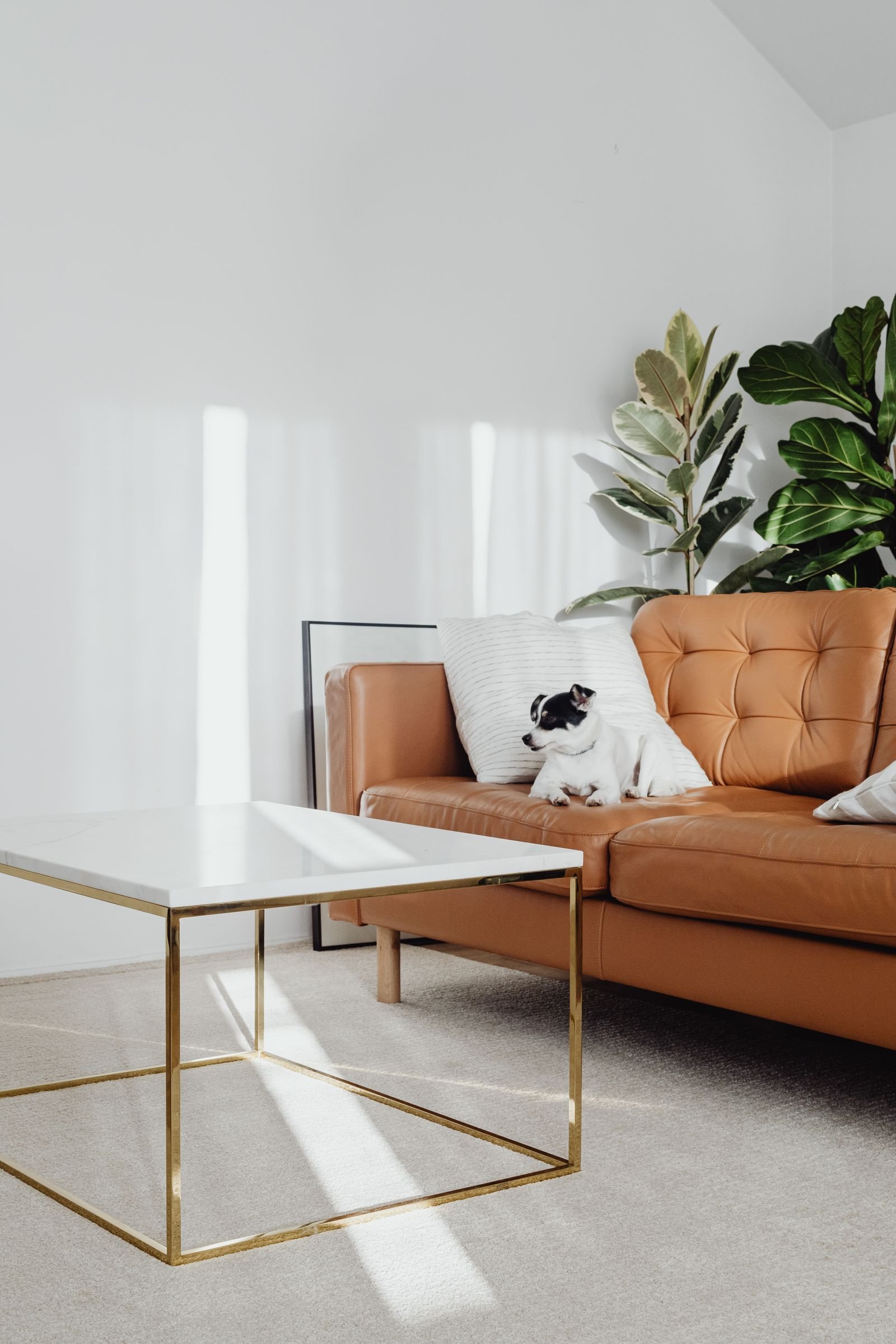
Dog-Friendly Living Room Ideas That Still Look Elegant
A living room can be dog-friendly and still look considered — it comes down to material choices more than giving anything up.
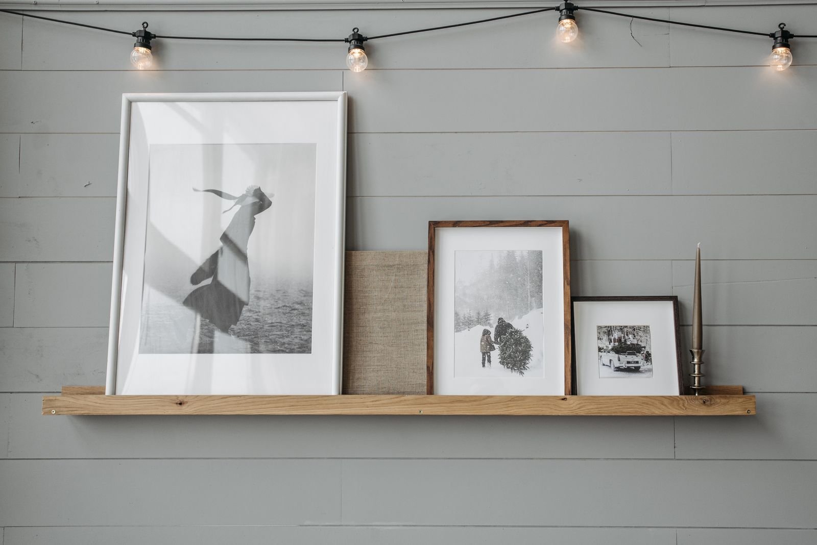
Affordable Wall Decor Ideas
One large print, a hung textile or a cluster of thrifted plates often does more for a wall, and costs less, than several small framed pieces.